Color Harmony: Part One
By Timo Rieke
In her book Color Problems from 1901, Emily Vanderpoel defines Harmony as “the pleasing effect due to the action upon each other of colors improved and made more beautiful by being put together; such an agreement between the different hues, tints, or shades of a design as will produce unity of effect.” We asked Professor Timo Rieke to define harmonious colors, and to explain what is known about the phenomenon.
–
Anyone will recognize harmonious color combinations immediately. On the other hand, it is far more difficult to prove that a combination is bad.
But let’s not start with color directly. You cannot explain anything from pure color alone. Color is a phenomenon that barely exists by itself – at the same time, nothing exists without color. It is we who give meaning to colors while being profoundly influenced by color. Color harmony is a complex idea, or as Gilles Deleuze points out: A pre-subjective affective power.
To understand the meaning of harmony, perhaps we think of two people being ‘harmonious’ together. Nobody really knows why two people appear to be harmonious, it is hard to calculate, though we could name a few reasons: Perhaps they’re interested in the same topics, they might be of the same age, or they might be related in another way. In this way, I think we also understand the idea of harmony when it comes to color. The question is: How are colors related? What is the relation between a building and a color? How does color relate to a product? Harmony is dependent on narration.

We recognize harmony by understanding the relationship between things and their relationship to us. Our brain rewards harmony. This is also why new things are never in harmony at first. We, our brain, has to get used to them. When the brain recognizes a fact again and again, it begins to create harmony through recognition. Our brain likes to understand the rules that we are confronted with, our brain likes identifiable context, our brain is lazy – our brain likes harmony. Harmony is dependent on perception.
Throughout our lives we have countless experiences of color; with objects, with spaces, whether in nature or in urban centers, or through visual media. Similar to learning language, we filter and internalize the codes that convey color as we grow up. These cumulative experiences structure the way we learn, and influence our further actions. For this purpose, these experiences are immediately and permanently recalled in order to interpret and understand the environment around us. A relatively stable world of signs and meanings is created. In utero, we are bodies with different sensors (eyes, skin, tongues, ears) that sense the world from early perceptions in the womb, and increasingly calibrate ourselves to the world around us in the best possible way. Visual perception in particular is dependent on the calibration of the other senses, because the visual sense does not permit direct contact with things.
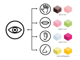
The correlation of object perception via the sense of touch with the visual signals (color/light/shadow) creates a meaningful visual image that is later dominated by the visual sense. To a certain extent, the sense of sight swallows the sense of touch and represents it for us. So when we look at a photo of a brick, the interpretation of the visual sense draws on the experiences of the sense of touch and conveys haptic signals like texture and weight. The entire visual perception functions according to this principle. Visual perception is therefore synaesthetic from the outset. The visual of pink yoghurt conveys the impression of strawberry; a beige color conveys the impression of dryness and sand; a round, yellow-orange surface can appear sweet and fruity. Harmony is dependent on context.
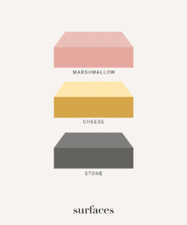
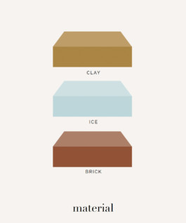
Emily Vanderpoel calls this unity of effect. If color is united with the surface of a sheet of paper, or the shape of an object or in the narration of a building, it creates certain kinds of harmony (it is put in the right place).
The connection between color and atmosphere or material impression is deeply rooted. Most people react to external stimuli, but do not consciously deal with color. We can like something, or perceive it as harmonious, authentic and of high quality, even if we cannot explain why. Our reaction to color is affective, just as we react affectively to music or the way of language and moods. We judge harmony based on past sensorial experiences and personal interactions. Harmony is dependent on individual differences.
We learn the subtleties of language only with time. Therefore, meanings are not always immediately apparent. The meaning of some texts can only be understood if you have had previous training; think of philosophical abstracts. Similarly, there are simple, very understandable color harmonies; but there are also color harmonies whose deeper logic can only be understood at second glance. The situation is similar with intuitive color concepts, whose logic only opens up mentally if you have a lot of experience, knowledge and empathy. It is the task of designers to understand, reflect and consciously apply the deeper meaning of design. Customers can afford the luxury of intuition, which means that you have to consciously control the requirements of a product in order to achieve the desired effect. You have to make sure that your product is understood. The tailoring to certain customer groups is therefore one of the most important. Some pieces of music will be heard at first and will not be understood without trained senses, and so may be dismissed as incoherent noise. For color harmonies this rule applies too. Harmony is dependent on personal experience and milieus.
Harmony is a mutable category. Nevertheless, there are common characteristics of the harmonious. These include the terms order, tonality, configuration, surface, interaction, association, similarity and attitude. Harmony is dependent on visual aesthetics and effects.
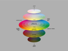
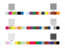
All theories of harmony help to understand the basic principles of harmony. One must not make the mistake of blindly trusting a specific teaching. In a globalized world, traditional harmonies – which often refer to naturalness and materiality, disappear in favor of world-harmonies – which have universal character, but originate from consumerist ethics, without representing an actual cultural basis. Today, color harmonies originate in the market, the media and the hierarchy of quality and cost.
Therefore, color harmonies or good color design today depend on the price of the goods or the price of architecture. The value of color is directly reflected in the monetary value of things. The iPhone PRO has a different color harmony than one without PRO. The expensive yoghurt has a better color design than the cheap, rudimentary one. The facade of the tourist center is of high quality, the hospice on the outskirts of the city is a non-place in white. Color harmony is a question of education and wallet. Color makes it easy to identify oneself as a contemporary. Harmony is dependent on status and prestige.
Timo Rieke is a designer who works across color, surface, haptics and synaesthetics. He is a professor at HAWK University of Applied Sciences and Art, a board member of the German Color Council, and the head of the Visual Haptics Lab in Hannover, Germany.
Color Harmony: Part One
By Timo Rieke
In her book Color Problems from 1901, Emily Vanderpoel defines Harmony as “the pleasing effect due to the action upon each other of colors improved and made more beautiful by being put together; such an agreement between the different hues, tints, or shades of a design as will produce unity of effect.” We asked Professor Timo Rieke to define harmonious colors, and to explain what is known about the phenomenon.
–
Anyone will recognize harmonious color combinations immediately. On the other hand, it is far more difficult to prove that a combination is bad.
But let’s not start with color directly. You cannot explain anything from pure color alone. Color is a phenomenon that barely exists by itself – at the same time, nothing exists without color. It is we who give meaning to colors while being profoundly influenced by color. Color harmony is a complex idea, or as Gilles Deleuze points out: A pre-subjective affective power.
To understand the meaning of harmony, perhaps we think of two people being ‘harmonious’ together. Nobody really knows why two people appear to be harmonious, it is hard to calculate, though we could name a few reasons: Perhaps they’re interested in the same topics, they might be of the same age, or they might be related in another way. In this way, I think we also understand the idea of harmony when it comes to color. The question is: How are colors related? What is the relation between a building and a color? How does color relate to a product? Harmony is dependent on narration.

We recognize harmony by understanding the relationship between things and their relationship to us. Our brain rewards harmony. This is also why new things are never in harmony at first. We, our brain, has to get used to them. When the brain recognizes a fact again and again, it begins to create harmony through recognition. Our brain likes to understand the rules that we are confronted with, our brain likes identifiable context, our brain is lazy – our brain likes harmony. Harmony is dependent on perception.
Throughout our lives we have countless experiences of color; with objects, with spaces, whether in nature or in urban centers, or through visual media. Similar to learning language, we filter and internalize the codes that convey color as we grow up. These cumulative experiences structure the way we learn, and influence our further actions. For this purpose, these experiences are immediately and permanently recalled in order to interpret and understand the environment around us. A relatively stable world of signs and meanings is created. In utero, we are bodies with different sensors (eyes, skin, tongues, ears) that sense the world from early perceptions in the womb, and increasingly calibrate ourselves to the world around us in the best possible way. Visual perception in particular is dependent on the calibration of the other senses, because the visual sense does not permit direct contact with things.

The correlation of object perception via the sense of touch with the visual signals (color/light/shadow) creates a meaningful visual image that is later dominated by the visual sense. To a certain extent, the sense of sight swallows the sense of touch and represents it for us. So when we look at a photo of a brick, the interpretation of the visual sense draws on the experiences of the sense of touch and conveys haptic signals like texture and weight. The entire visual perception functions according to this principle. Visual perception is therefore synaesthetic from the outset. The visual of pink yoghurt conveys the impression of strawberry; a beige color conveys the impression of dryness and sand; a round, yellow-orange surface can appear sweet and fruity. Harmony is dependent on context.


Emily Vanderpoel calls this unity of effect. If color is united with the surface of a sheet of paper, or the shape of an object or in the narration of a building, it creates certain kinds of harmony (it is put in the right place).
The connection between color and atmosphere or material impression is deeply rooted. Most people react to external stimuli, but do not consciously deal with color. We can like something, or perceive it as harmonious, authentic and of high quality, even if we cannot explain why. Our reaction to color is affective, just as we react affectively to music or the way of language and moods. We judge harmony based on past sensorial experiences and personal interactions. Harmony is dependent on individual differences.
We learn the subtleties of language only with time. Therefore, meanings are not always immediately apparent. The meaning of some texts can only be understood if you have had previous training; think of philosophical abstracts. Similarly, there are simple, very understandable color harmonies; but there are also color harmonies whose deeper logic can only be understood at second glance. The situation is similar with intuitive color concepts, whose logic only opens up mentally if you have a lot of experience, knowledge and empathy. It is the task of designers to understand, reflect and consciously apply the deeper meaning of design. Customers can afford the luxury of intuition, which means that you have to consciously control the requirements of a product in order to achieve the desired effect. You have to make sure that your product is understood. The tailoring to certain customer groups is therefore one of the most important. Some pieces of music will be heard at first and will not be understood without trained senses, and so may be dismissed as incoherent noise. For color harmonies this rule applies too. Harmony is dependent on personal experience and milieus.
Harmony is a mutable category. Nevertheless, there are common characteristics of the harmonious. These include the terms order, tonality, configuration, surface, interaction, association, similarity and attitude. Harmony is dependent on visual aesthetics and effects.


All theories of harmony help to understand the basic principles of harmony. One must not make the mistake of blindly trusting a specific teaching. In a globalized world, traditional harmonies – which often refer to naturalness and materiality, disappear in favor of world-harmonies – which have universal character, but originate from consumerist ethics, without representing an actual cultural basis. Today, color harmonies originate in the market, the media and the hierarchy of quality and cost.
Therefore, color harmonies or good color design today depend on the price of the goods or the price of architecture. The value of color is directly reflected in the monetary value of things. The iPhone PRO has a different color harmony than one without PRO. The expensive yoghurt has a better color design than the cheap, rudimentary one. The facade of the tourist center is of high quality, the hospice on the outskirts of the city is a non-place in white. Color harmony is a question of education and wallet. Color makes it easy to identify oneself as a contemporary. Harmony is dependent on status and prestige.
Timo Rieke is a designer who works across color, surface, haptics and synaesthetics. He is a professor at HAWK University of Applied Sciences and Art, a board member of the German Color Council, and the head of the Visual Haptics Lab in Hannover, Germany.